
Data Visualizations for the K-Means Clustering Analysis of Chicago Population
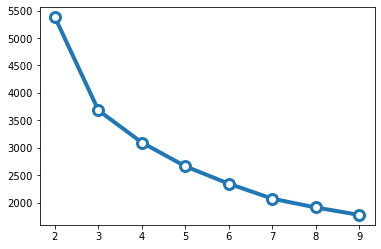
1. Select # of clusters with the scree plot
Below shows that the elbow in the plot of SSE against clustering solution is about 3 (from 2 to 3 there is a distinct drop in within groups sum of squares), after which this decrease drops off dramatically, suggesting that a 3-cluster solution may be a good fit to the data. Generally, a smaller number around 2 or 3 is better as it increases the interpretability of the clustering results.
2. Interactive Altair Plots
The interactive map below shows that ethnic enclaves are primarily in the center and south (including the Black Belt), while high society are in the CBD (areas near Cloud Gate) and the northern areas, which are the affluent neighborhoods. Diverse communities are about the two. The map also shows you the GEOIDs (representing each of the 4000 block groups), income, percent ethnic, and percent bachelor or higher as well as the particular cluster it belongs as you hover over the map (same for the other plot).
From the interactive Altair plot, we see that cluster 2 clearly dominated both the high income and high education ends and are generally smaller dots (meaning less diverse), and cluster 0 stayed in the bottom left corner where both income and education are the lowest with larger dots (highest diversity, but most underprivileged). Diverse community (cluster 1) is in between the two.
These were produced using Altair and embedded in this static web page.
3. Results Table
From the tabular results we see that there are three groups of distinct populations/communities with the following characteristics:
- cluster 0 (or #1): ethnic enclave of concentrated poverty (low-income, high ethnicity (~91%), low education)
- cluster 1: diverse community (mixed-income, mixed race (~40%), average education)
- cluster 2: high society (very high-income, predominantly white, high education (over 54% has a bachelor’s degree or higher))
We see that the clusters are indeed very distinct. The difference between the percent_bachmore of cluster 0 and 2 is nearly 5 times. Cluster 2’s income is twice of cluster 1 and 3 times of cluster 2.
| label | perc_ethnic | perc_bachmore | income | |
|---|---|---|---|---|
| 0 | 0 | 90.72 | 11.46 | 42006.81 |
| 1 | 1 | 40.31 | 28.12 | 69240.99 |
| 2 | 2 | 23.31 | 54.28 | 128873.86 |